How does Optibrium protect customer data?
The age of data The internet has transformed the way the world does business. As hardware and software have evolved,…
The age of data The internet has transformed the way the world does business. As hardware and software have evolved,…
The launch of StarDrop 8 adds powerful real-time collaboration to our medicinal chemistry toolkit for molecule design, optimisation and data…
What value does AI offer in drug discovery? The potential is huge: To learn more about the value we’re seeing…
What is Derek Nexus? Developed by Lhasa Limited, Derek Nexus is an expert-knowledge based system that draws on over 40…

What are StarDrop and Semeta? Semeta is a tailored platform for DMPK scientists. It enables users to address key challenges…
Peer-reviewed study published in Xenobiotica describes an innovative new method that predicts the routes and products of Phase I and II metabolism with high sensitivity and greater precision than
other approaches

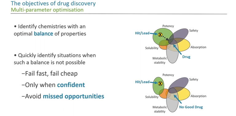
In this webinar, we look at how we can use data visualisation in an impactful and effective way to communicate many dimensions of information. We illustrate some of the ways that we can achieve this and discuss visual methods to guide our decisions in drug discovery.
This article explores the benefits of a more intuitive and flexible approach to viewing and interacting with drug discovery data,…
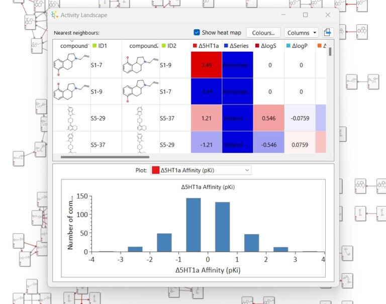
This short video gives an introduction to the Activity Landscape analysis tool in StarDrop and how you can view and…
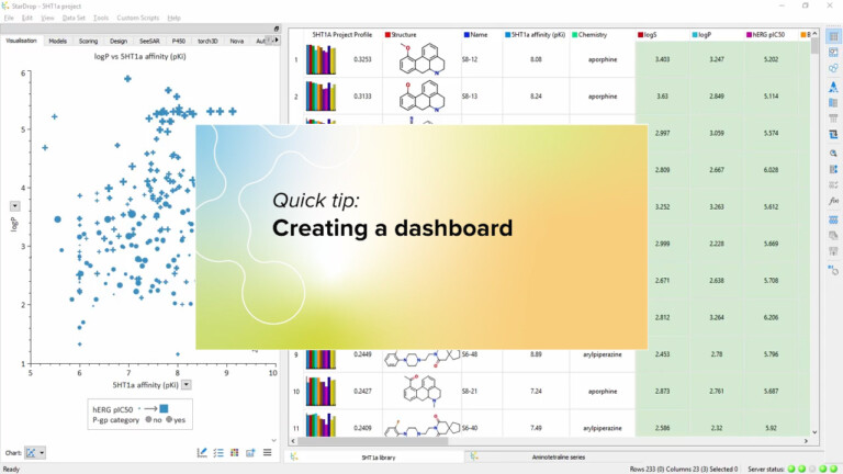
In this video, we’ll see how to create a ‘dashboard’ containing multiple interactive charts, giving an instant overview of your…
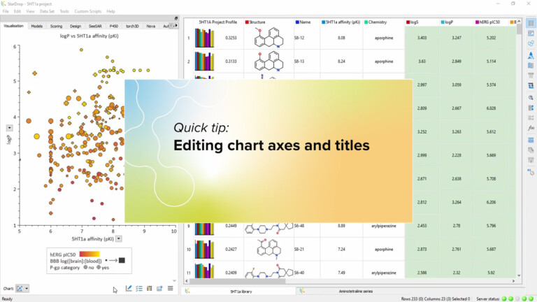
Watch this video to see how you can edit the title of your chart and its axes, to precisely define…
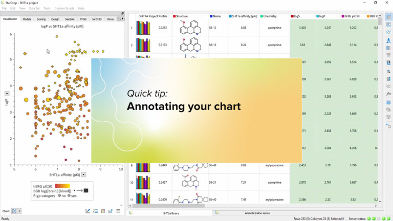
You can add labels to your charts showing structure and data for key compounds or display your comments. Watch this…
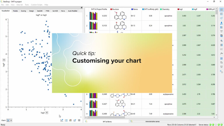
To see some of the many ways you can customise your chart, by setting fonts and colours or adding grids…
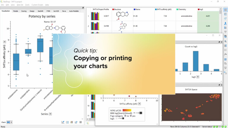
In this video we show how easy it is to copy your charts directly into your presentations and reports or…
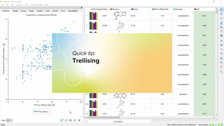
A trellis enables you to compare the same chart for multiple categories of compound. This video shows you how, with…
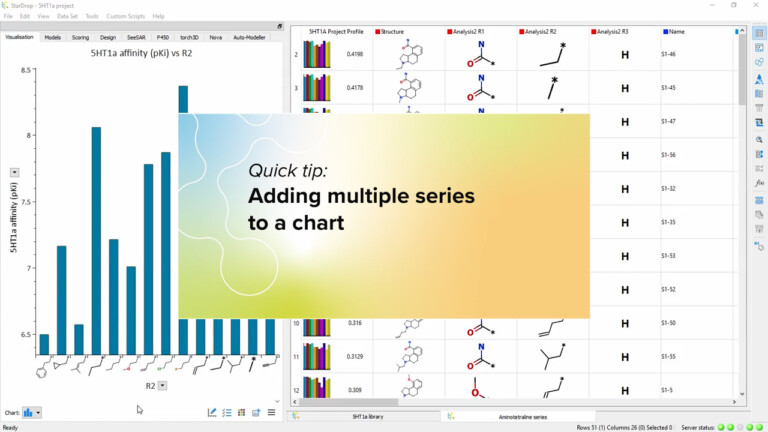
You can create very information-rich visualisations by plotting multiple series on a single chart. In this video, we’ll show you…
This short video gives an introduction to the Clustering tool in StarDrop and how you can interact with the results…
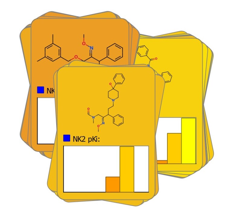
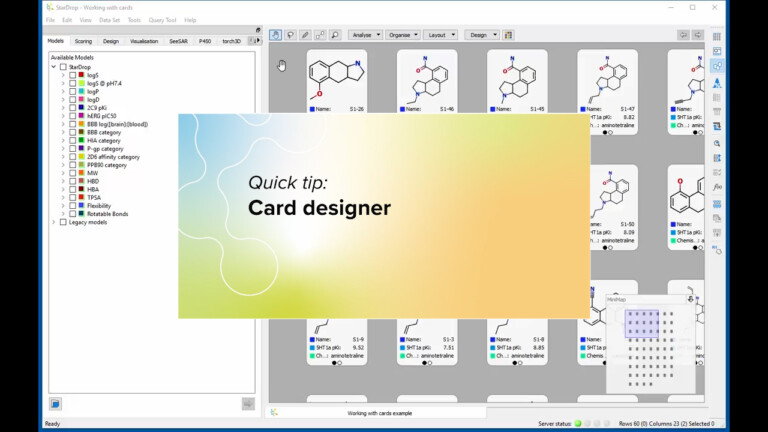
This short video illustrates how to you can create cards of any dimensions and lay out your data in a…