Activity neighbourhoods
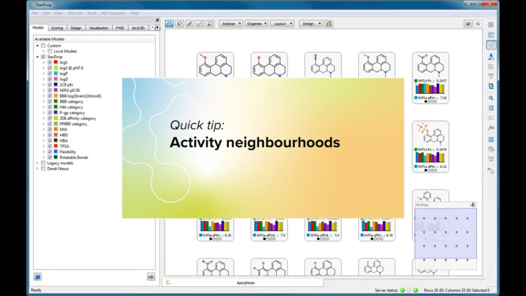
This short video gives an introduction to the Activity Neighbourhood analysis tool in StarDrop’s Card View.

In StarDrop you can display heat maps for the properties contributing to an MPO score. We’ve extended this capability by adding a feature that lets you colour StarDrop data sets based on any property values. This enables you to highlight interesting compounds and data and explore your data sets more efficiently.
Also it is an improved way to highlight selected compounds or data in chart. Instead of colouring the selected points, unselected points are faded in a chart, making it easier to see those that have been selected and any colour formatting.
This short video gives an introduction to the Activity Neighbourhood analysis tool in StarDrop’s Card View.

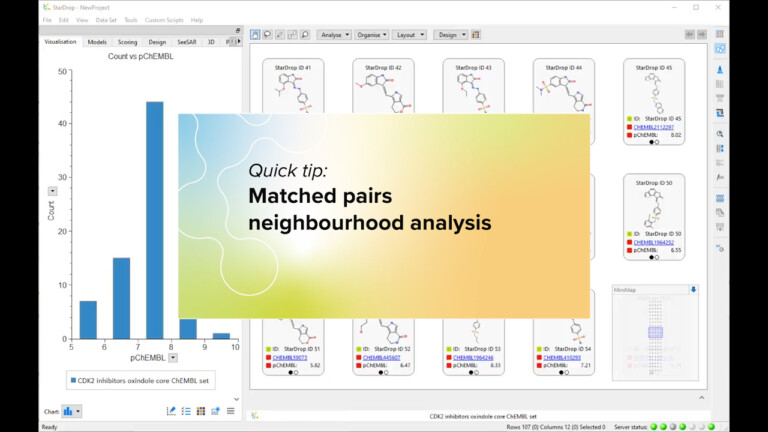
This short video gives an introduction to the Matched Pairs Neighbourhood tool in StarDrop’s Card View. If you are interested…

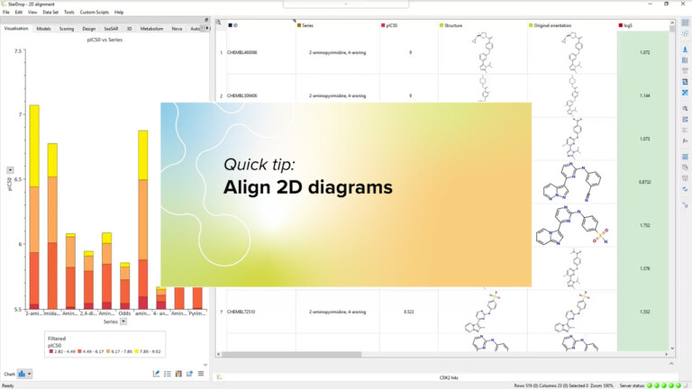
Using the 2D structure alignment tool in StarDrop, define a substructure to perform a rigid alignment of molecules in the data set.
