Annotating your chart in StarDrop
You can add labels to your charts showing structure and data for key compounds or display your comments. Watch this…
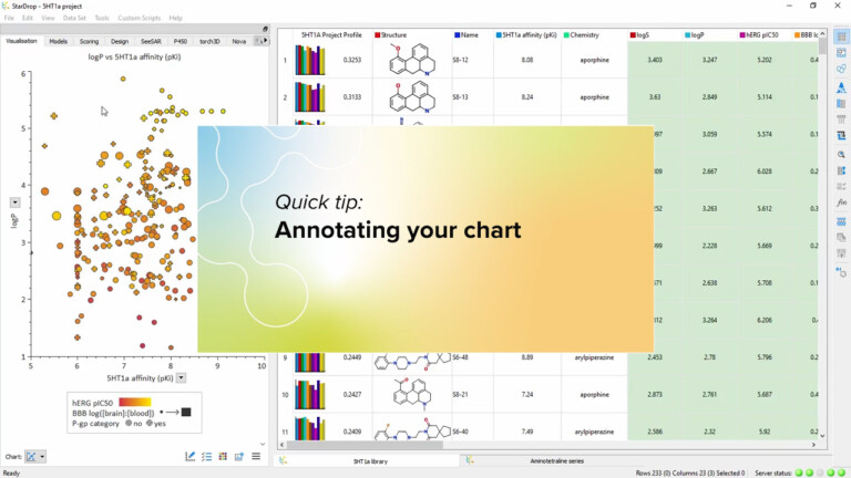
You can add labels to your charts showing structure and data for key compounds or display your comments. Watch this…
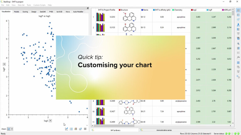
To see some of the many ways you can customise your chart, by setting fonts and colours or adding grids…
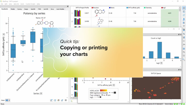
In this video we show how easy it is to copy your charts directly into your presentations and reports or…
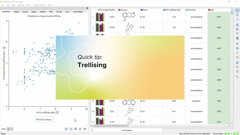
A trellis enables you to compare the same chart for multiple categories of compound. This video shows you how, with…
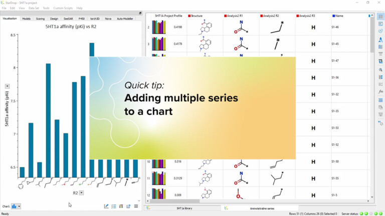
You can create very information-rich visualisations by plotting multiple series on a single chart. In this video, we’ll show you…
This short video gives an introduction to the Clustering tool in StarDrop and how you can interact with the results…
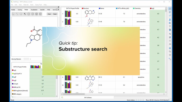
This short video illustrates how to perform flexible substructure searches, including variable atoms, bonds and linkers using StarDrop’s Find tool.
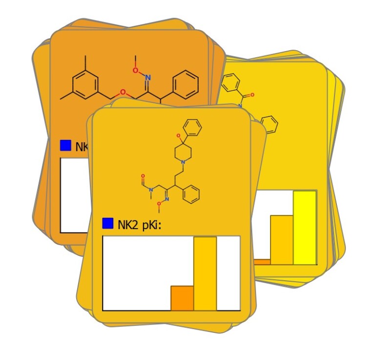
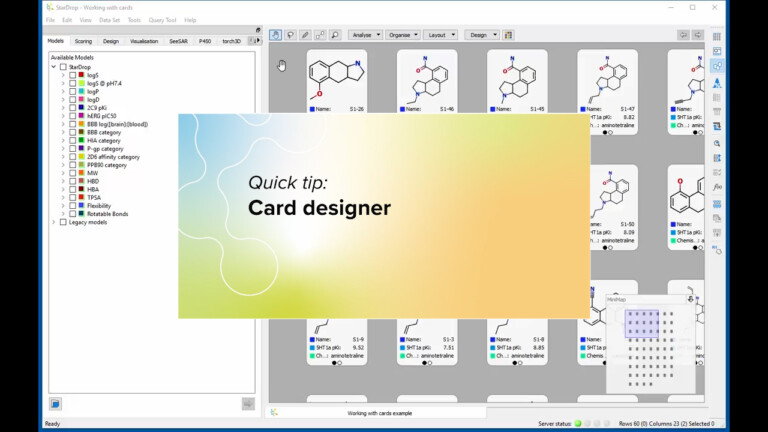
This short video illustrates how to you can create cards of any dimensions and lay out your data in a…
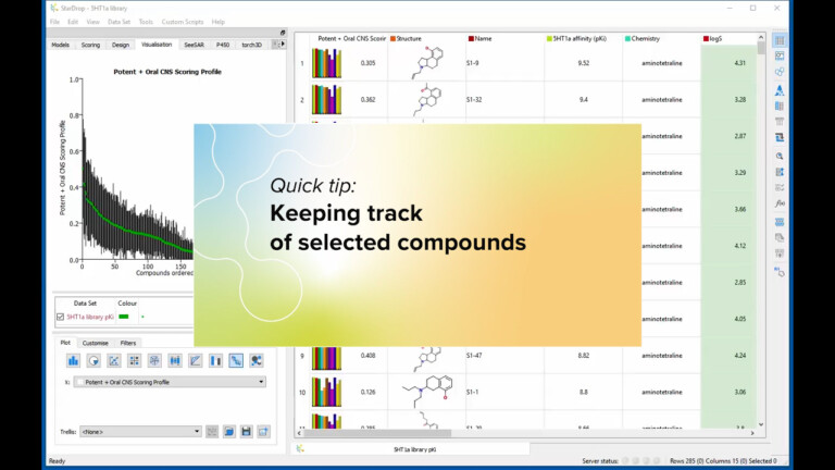
StarDrop provides a number of ways to help you keep track of compounds you have selected. Take a look at…
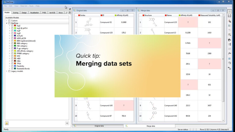
Do you ever have trouble merging new experimental data back in with all the other information you have for your…
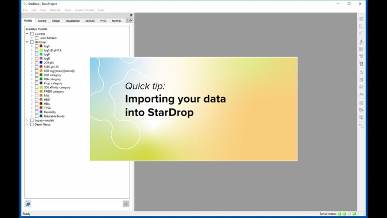
This short video illustrates how to import your data into StarDrop from standard file formats, such as SD, SMILES, CSV…
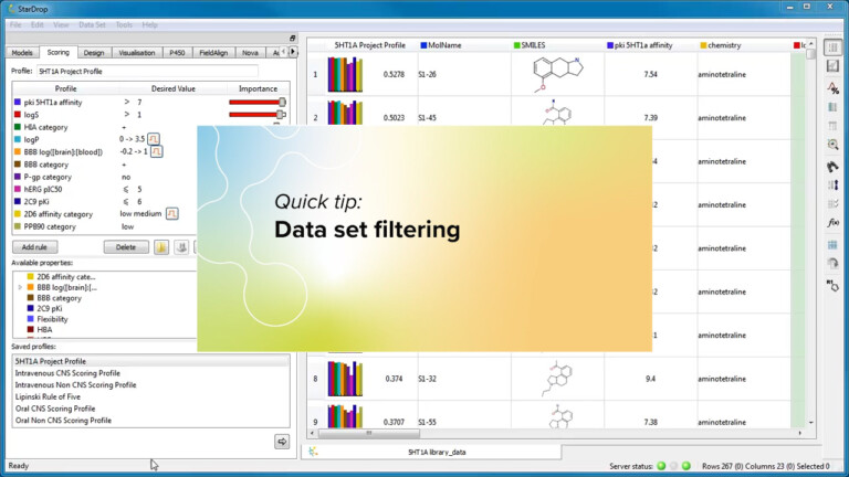
This short video illustrates how to use the data set filtering tool within StarDrop to remove compounds with unwanted substructures…
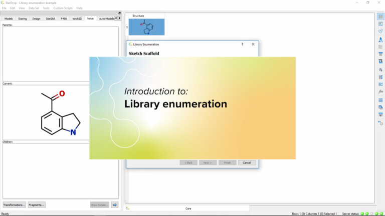
Explore the virtual library design capability as part of StarDrop’s Nova module, providing flexible and easy scaffold-based enumeration of a virtual library.…
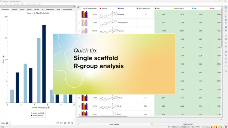
In this quick example, we will look at a single-scaffold R-group analysis to identify any functionalities which are influencing potency. The data…
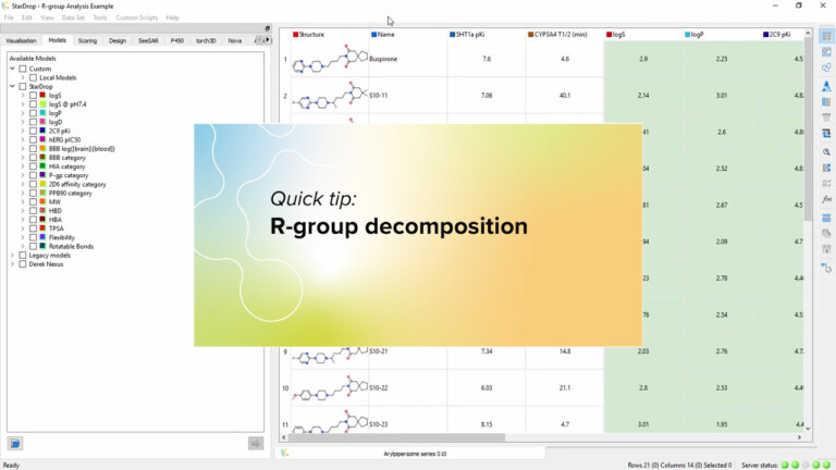
StarDrop’s R-group analysis makes it quick and easy to explore the variation of properties by the substituents within a chemical series. This…
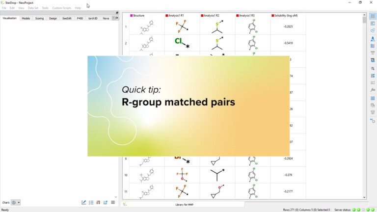
This short video illustrates how to perform Matched Molecular Pair Analysis (MMPA) within a chemical series using StarDrop’s R-group analysis tool. This…
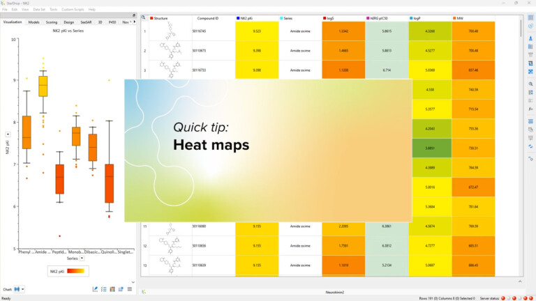
In StarDrop you can display heat maps for the properties contributing to an MPO score. We’ve extended this capability by…
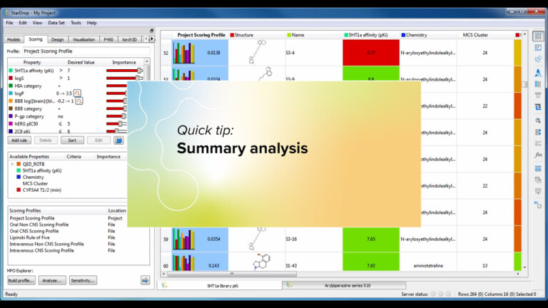
StarDrop’s summary analysis tool enables you to quickly see trends across the properties in your data sets. Take a look…
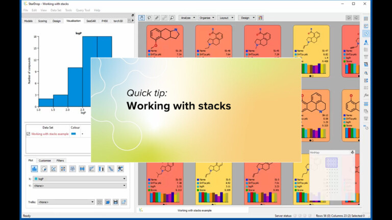
This short video gives an introduction to working with stacks in StarDrop’s Card View.