Activity neighbourhoods
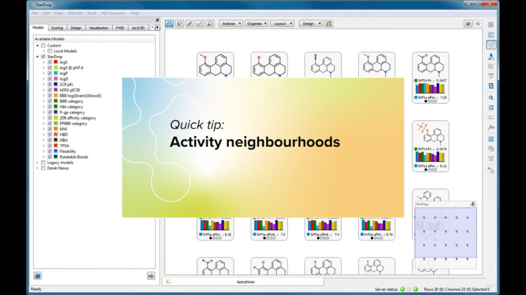
This short video gives an introduction to the Activity Neighbourhood analysis tool in StarDrop’s Card View.

A Glowing Molecule represents the model result indicating the parts of the molecule that have the greatest influence on the prediction. A Glowing Molecule is displayed as a heat map in which the regions of the molecule increasing the prediction are coloured red, the regions decreasing the prediction are coloured blue, and regions having no overall influence are coloured green. The colours are interpolated between these extremes to indicate a greater or lesser effect.
Note: For some properties, an increase might be desirable, whereas, for others, it may be undesirable.
Visit Glowing Molecule for more information.
This short video gives an introduction to the Activity Neighbourhood analysis tool in StarDrop’s Card View.

During this example we will consider three compounds from a lead series which we would like to try to evolve into a candidate. The compound has a good profile of ADME properties but insufficient inhibition of the target, the Serotonin transporter. In this example we will use StarDrop’s Nova module to generate new ideas for compounds to improve the potency while maintaining the balance of other properties.

This worked example uses Inspyra™ to interactively explore optimisation strategies to achieve a selective inhibitor of DPP-4 with appropriate physicochemical properties.
