Creating a dashboard in StarDrop
In this video, we’ll see how to create a ‘dashboard’ containing multiple interactive charts, giving an instant overview of your…
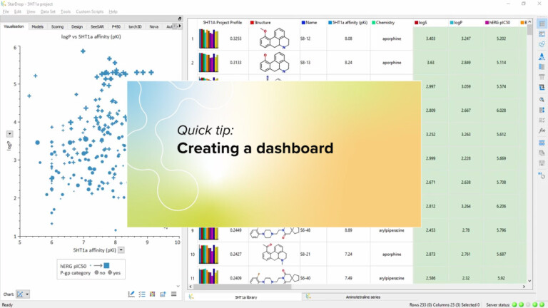
In this video, we’ll see how to create a ‘dashboard’ containing multiple interactive charts, giving an instant overview of your…
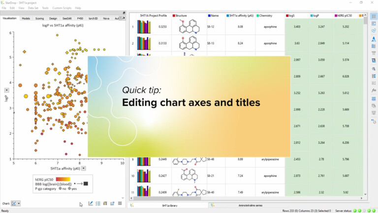
Watch this video to see how you can edit the title of your chart and its axes, to precisely define…
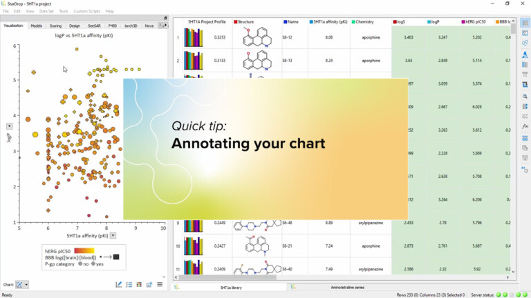
You can add labels to your charts showing structure and data for key compounds or display your comments. Watch this…
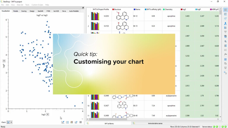
To see some of the many ways you can customise your chart, by setting fonts and colours or adding grids…
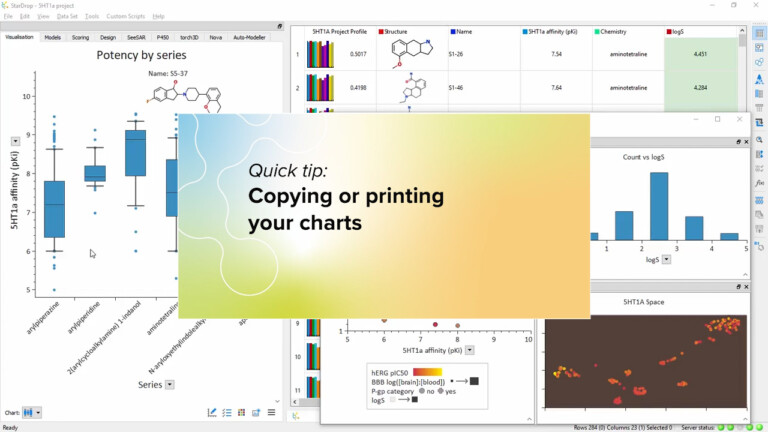
In this video we show how easy it is to copy your charts directly into your presentations and reports or…
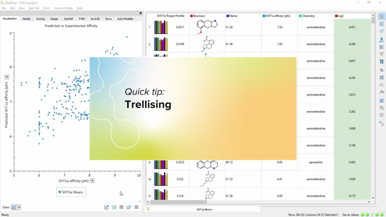
A trellis enables you to compare the same chart for multiple categories of compound. This video shows you how, with…
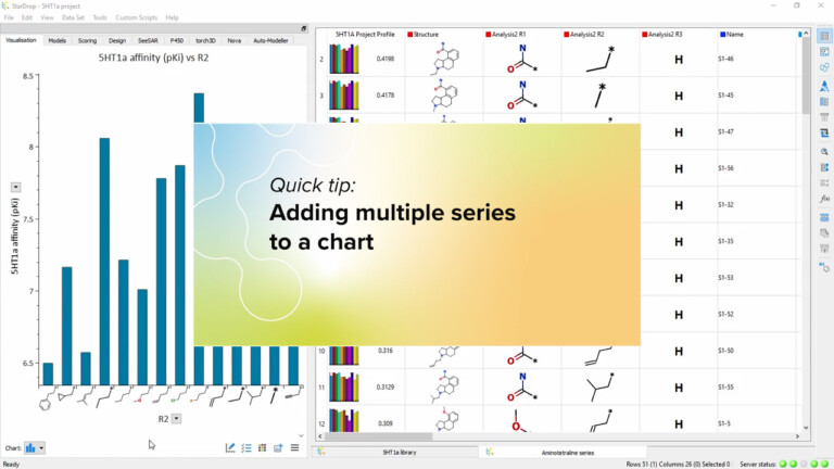
You can create very information-rich visualisations by plotting multiple series on a single chart. In this video, we’ll show you…
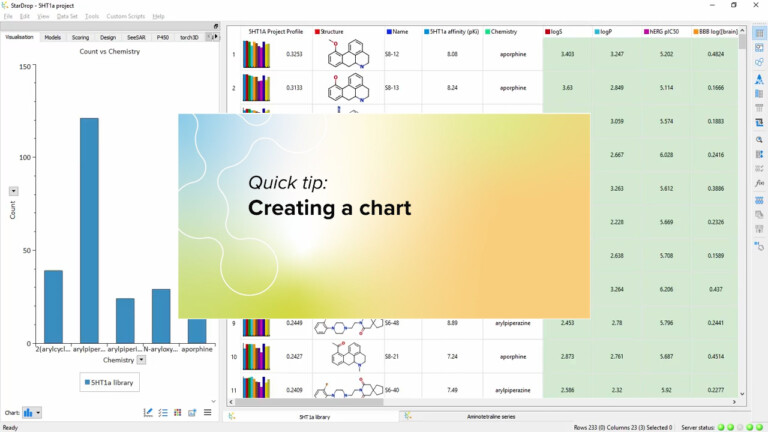
This short video introduces how to use the data visualisation in StarDrop to quickly create a chart in StarDrop from your data.
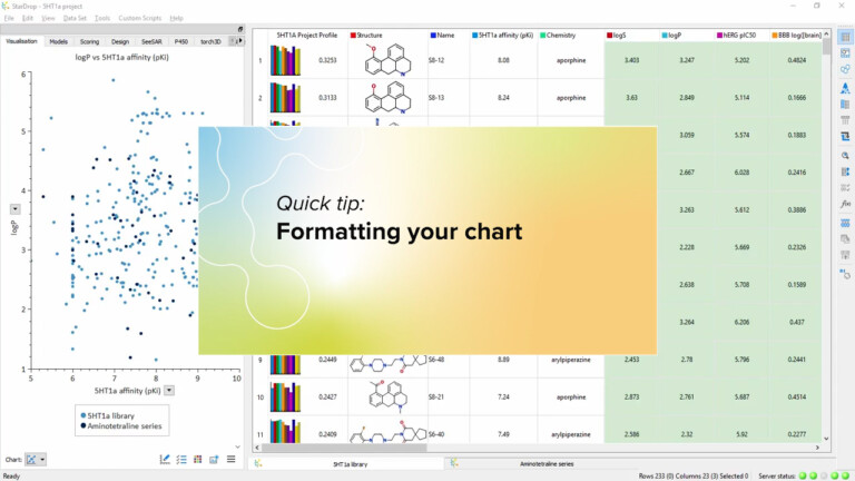
This video demonstrates how to format your charts, using the properties in your data set, by colour, size, symbol, transparency.
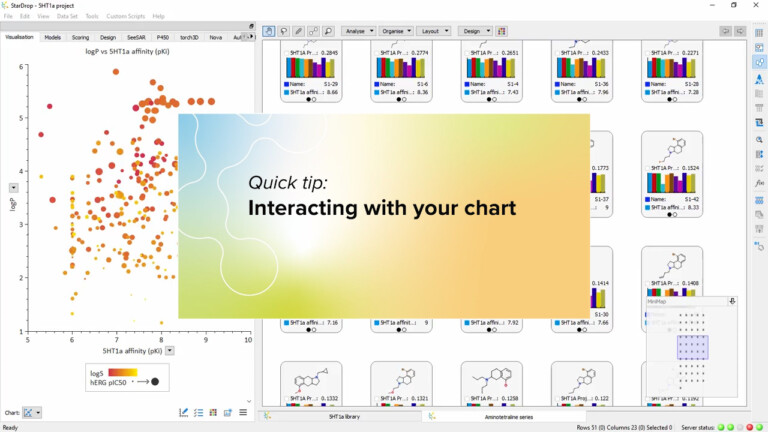
In this quick video, we show the many ways you can interact with your chart to show exactly the data…