Creating a chart In StarDrop
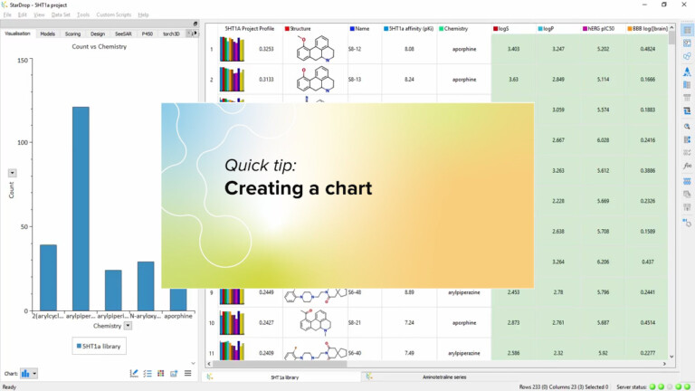
This short video introduces how to use the data visualisation in StarDrop to quickly create a chart in StarDrop from your data.

To select compounds, click on the structure or on the row number in the data table. To select multiple compounds, hold the Ctrl (Windows) or Cmd (Mac) key and click on the rows you want to select.
To select a range of compounds, select the first compound then hold the Shift key and click on the compound at the end of the desired range.
To make selections from a plot or visualisation, click or lasso points or click a bar in a histogram to select the corresponding compounds in the data table or Card View.
This short video introduces how to use the data visualisation in StarDrop to quickly create a chart in StarDrop from your data.

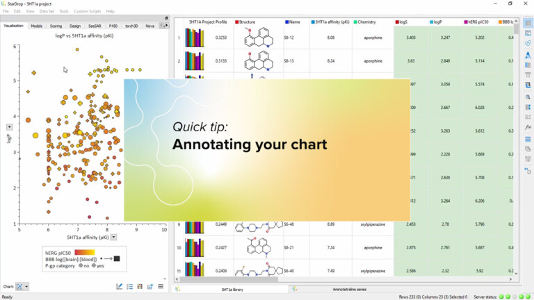
You can add labels to your charts showing structure and data for key compounds or display your comments. Watch this…

This short video gives an introduction to the Clustering tool in StarDrop and how you can interact with the results…
